Dah-dah-dah-dah! It’s that time of the year again where I show you things from Soko Banish 1.3 to drool over – or perhaps even vaguely appreciate. Huzzah! Let’s get on with it, shall we?
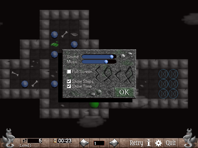 |
| Conserve energy: turn off the lights when you change your settings. |
There are two things to see here, the first of which are the settings. These are what pops up when the player presses “Escape” now, replacing the ugly old retry and quit pop-up and darkening the rest of the screen as is all the rage in pop-up menu fashion. I mentioned the settings on [my previous post] and I don’t think there are any big surprises here, but I still wanted to showcase how it actually looks in action right now. The runes spell “Soko”, in case you were wondering – the game has had that little thing going about Germanic runes appearing here and there because old-timey magicks, though I may not be doing much more with that.
Perhaps more surprisingly (and illuminated for your convenience), we can see the new status bar thingy, formerly known as wasted screen space. I’m not sure what I was thinking when I originally dedicated the entire bottom row of tiles to only a small level changer, but the bar finally has all the kinds of useful things one would expect to find there, like basic GUI functions.
I had actually already done this in what would have become Soko Banish’s “Necronomicon” expansion before I scrapped it, but I’m not exactly crazy about recycling old material from 2006/07 when I don’t absolutely have to, so I started it over from scratch, taking the opportunity to tinker with the graphics a bit to turn vaguely wood-looking blocks into something more akin to limestone. The wyvern(?) statues are still the old ones – I might update them some day, but I’ll need to be careful with that; they’re a very characteristic part of the game’s appearance.
So, what’s new here? From left to right, we first see the new step counter in action, counting steps like a step counter does. Those are footprints on the icon, in case it’s too tiny to tell. Next to that is the timer, counting in minutes and seconds and going up to 99:99, which I hope no one’s going to legitimately want to exceed in a single session of playing a 20×14 Sokoban puzzle (though if you do have that sort of time to waste, let me know and I may have some tasks for you!). Both of these can be switched off in the settings and will be switched off by default, as this kind of game honestly ought to be about finding solutions to the puzzles and not optimising your performance. Results aren’t saved, but if you care about such stats, you can now see them while you play! Oh, and there’s the level name at the bottom, which is automatically filled in as “Level #” for untitled levels – such as this one, and pretty much every other level right now because the meta data pixies are lazy clods.
On the other side of the level selection (which works the same as it always has) are a couple of useful buttons. Retry and Quit are finally where you would expect them to be instead of being confined to an unnecessary Esc menu – this also means no menu will pop up when the player character dies now, allowing you to undo if you’d rather not start the whole thing over. The gear once again opens the settings, while the fat “i” stands for info and displays the level’s meta data in a pop-up. I was considering showing this automatically at the start of each level, as happens in the brilliant MESH: Hero games that I heartily recommend and am not being paid to advertise, but I figured it’s probably nicer to see the actual levels when zapping around. No more pop-ups! Except when you want them.
So, what’s next? Apart from some graphics work: converting all the old stages, finishing up a half-finished feature or two and a lot of testing. There are tons of things that I’d love to see in the game eventually (saving solutions! Saving level states! Saving Private Ryan!), but I think people would rather be able to actually play this than listen to me rant and rave about all the things they don’t get to try out yet. Considering the 1.1 update was as significant as fixing a bug and adding a blinking animation, it’s about time to get 1.3 ready for release before it turns into version 3.1, growing up without its version number parents so it can dress like a flying mammal to spread fear into the hearts of software bugs and terrible GUI approaches.